Thursday 31 March 2011

dreams of spring and dresses


Spring is still struggling to take over winter, but warmer degrees are promised for the weekend. Meanwhile I’m bringing spring to my ears with the new Noah and the Whale album Last Night On Earth, and dreaming of new dresses that I most likely won’t buy from Sivletto. If I would splash out on myself, I definitely would start with this green beauty from Tara Starlet. It’s such a nice every day dress, and I’m very much feeling the green nowadays. Could be the whole spring thing.


This isn’t as much a spring fling dress, but when do you not need another perfect black dress? In fact I hardly have one as it is, the best one needs a visit to a tailor actually. I don’t really know where to go for that, but I guess I should just find that out before I start buying new dresses to ”replace” an almost perfect one. This cute wiggle dress is called Stella and is from Steady Clothing.


The last one I would actually prefer in red with white dots, or even more preferably in red gingham. It’s from Heartbreaker Fashion. But if someone wanted to just give it to me, I definitely wouldn’t turn down the black one either, it is rather lovely too. I happen to know there are quite a few shops in London that carries these or similar kinds of retro 50’s and 60’s clothing, and if I happen to stumble upon one of them, and if they happen to have some items on sale, and if these items happen to be my size, they might just end up in my suitcase. I’m just saying.

Tuesday 29 March 2011

Shaun Tan: winner of the ALMA award 2011


Winner of 2011’s ALMA award (The Astrid Lindgren Memorial Award) is Australian illustrator Shaun Tan. I have only seen parts of his already awarded picture book The Arrival (2006), and been very impressed. Just take a look at this one picture, which is from that book. Amazing.
From the press release:

Shaun Tan is a masterly visual storyteller, pointing the way ahead to new possibilities for picture books. His pictorial worlds constitute a separate universe where nothing is self-evident and anything is possible. Memories of childhood and adolescence are fixed reference points, but the pictorial narrative is universal and touches everyone, regardless of age.

Behind a wealth of minutely detailed pictures, where civilization is criticized and history depicted through symbolism, there is a palpable warmth. People are always present, and Shaun Tan portrays both our searching and our alienation. He combines brilliant, magical narrative skill with deep humanism.

Sounds pretty good to me, and a worthy winner. I must get my hands on that book now, before it sells out.

Friday 25 March 2011

exceptional book covers: oceans


There are few things online I find more relaxing and rewarding than browsing The Book Cover Archive. Today I decided to share a selection of ocean related beauties, just because. Maybe I’m secretly dreaming of a beach somewhere far far away. Although I actually live on an island here in Stockholm, so there’s definitely no lack of water around here. Not that many whales around though, or shells. This first book is designed by Leo Nickolls.


Next up is one by Allison Saltzman.


Followed by brilliant typographer Marian Bantjes, who I admire big time.


Another book on fishing, this one designed by Helen Yentus, whose portfolio is very impressing indeed.


Finally a book designed by John Fulbrook III. In our Durban home we’ve got a small beautiful ceramic bowl, which was part of a wedding gift, filled with tiny shells from a beach on the North Coast outside of Durban. Always reminding us of a wonderful weekend spent there in June 2009. It was truly one of the strangest experiences I’ve had, because as soon as we arrived there and parked the car, time slowed down in the most remarkable way. I’ve heard of sleepy seaside villages, but I don’t think this was what was going on, at least I felt very much awake. And completely relaxed the entire time. We spent probably 2 hours shell picking or just sitting on the beach, watching the sea, but it felt like an entire day. I wish myself back to that feeling.

Thursday 24 March 2011

particularly pretty and tasty penguins


I’ve got a serious craving for colour at the moment, partly because spring is finally about to burst for real. This new Penguin Classics series definitely fits that need. Now I’m hoping they will be available in April, when I’m going to London for a few days. They are designed by genius Coralie Bickford-Smith, just like I needed more reasons to adore her. Well I do. One day maybe I will live in a house big enough to decorate an entire room with Penguin Classics. It would be the most beautiful room ever.


Monday 21 March 2011

ragnar persson: bats, birds and beasts


A few years back I saw one huge drawing/artwork by Swedish artist Ragnar Persson, in a collective art show. His piece was the only one that made an impression on me that lasted. His use of pencil, and drawings of birds, owls, bats, beasts, trees and skulls, among other things, just speak directly to my eyes and my heart. It’s both beautiful and slightly haunting, the best combination I know when it comes to art. Yesterday I went to see some of his work that’s currently being exhibited at Kulturhuset, The Culture House, in Stockholm. Turns out they’ve put him in a corner, and mostly glued printed posters so high up you can’t even see them. Disappointing to say the least, but I did enjoy looking at what I could.


Ragnar Persson’s website isn’t up yet, but it will be found here. You can read a short interview with him here, and see some more pics. And if you happen to be in Stockholm, the corner where you can see his works is the furthest one to the right at the bottom floor, next to the library.

Dokument Press, a small Swedish publisher, has had the good sense of publishing a book with Ragnar Persson’s drawings, called Feel the Darkness. I think I need to get it.

Friday 18 March 2011

one more beautiful book cover


I hardly have anything to add to this gorgeous cover, to me it’s so obvious why I love it. It’s published by Vintage, and genius art director John Gall has made it. Just go and check his work out here, and then tell me he is not one of the most brilliant book designers ever. I dare you. Looking at this piece of beauty makes me not care so much that it started snowing again.

Thursday 17 March 2011

su blackwell: paper queen


A good friend with excellent taste recently introduced me to the awesome paper cutting art of Su Blackwell. She’s a British artist and art director, and truly excels in paper cutting, predominantly working by hand, using a scalpell to create her beautiful and intricate pieces. She likes working within the realms of fairytales and folklore, and I particularly love her book sculptures.

In her own words: ”For the cut-out illustrations, I tend to lean towards young-girl characters, placing them in haunting, fragile settings, expressing the vulnerability of childhood, while also conveying a sense of childhood anxiety and wonder. There is a quiet melancholy in the work, depicted in the material used, and choice of subtle colour.”


I wish I will get to see these in real life one day, to even more appreciate the handicraft and details up close. For now I will just be grateful that I was pointed in Su Blackwell’s direction at all, and admire her work from afar.

Also, I might get my hands on this book once it gets out, it looks very promising indeed.

Tuesday 15 March 2011

illustrative ms. lizzy stewart


I’ve just fallen in love with a new illustrator: Lizzy Stewart, from UK. According to her website she is a fan of pencils, cardigans and russian history. And also bears. Most importantly though, in my humble opinion, she has named both her website and blog after my favorite song of all time: About Today by The National. After just reading the last few posts on the blog, I’ve also learnt that she’s got good taste in music in general it seems, and I’m jealous that she’s gotten to see The Decemberists a lot more times than me (just the one time for me, so far ...). Speaking of The Decemberists, her style reminds me a lot of Carson Ellis, which I don’t mind one bit. But enough talking, let’s take a closer look at all the things to fall in love with.


These last ones are illustrations of Swedish tings! I love those smiling lion statues that you’ll find along the street of Drottninggatan in Stockholm. So cute.

Ms. Lizzy Stewart, you’ve got yourself a new fan in the city I’m guessing you once visited. I’ll keep my eyes on your work from now on.

Monday 14 March 2011

reader digest: poetry & recipes


Today Tearoom Books launches a free e-book, Reader Digest: Poetry & recipes. It’s a e-chapbook of poetry and recipes, compiled by Pravasan Pillay and Victoria Williams, and features 13 poets from 5 different countries. Poets were asked to pair their poems with a suitable recipe and the result is a deliciously good read.

I’m responsible for the design of the book, and had great fun doing it. Well, to be honest it took a few takes before the cover finally came into place, but I’m very happy with the final result. And of course it’s a good read too, so head over there to download it now!

On another note: if you have the means, please donate what you can spare for the rescuing work in Japan. It can be as easy as sending a text message, and every little donation will add up to help Japan get back on it’s feet.

Friday 11 March 2011

book cover of the day


There is something quite predictable about me falling in love with this cover, being me and knowing my taste that is. When it comes to certain things I rarely surprise myself. Nor do I think I necessarily have to. I’m quite content with my taste, and being predictable. This particular book comes from Melville House Publishing, a publisher with incredibly good taste in book covers. Even though I at the moment spend most of my days at work looking at different book cover designs, I can’t seem to get enough of them when I stumble upon a good selection like theirs. In case you happen to live in New York and be a really good editor they are actually looking for one right now, and it sounds like an awesome job, if you ask me. I’m not an editor, and I don’t live in New York, but I still think I might be right for the job.

As I won’t get it since I’m not applying, I will do the next best thing and order a copy of the book. Not because I love the cover so much, but because this is a very good round-up of musicians and I’m very interested in reading them without listening to them. Or I guess I could though, I can’t read in silence. It’s too awkward, somehow. Like holding a monologue in my head, and not allowing anyone else to say anything. That’s just rude.

Wednesday 9 March 2011

if i had vintage walls


By accident I found this awesome British company called Sanderson, who amongst other things make wallpapers and fabrics for interior design. They’re really old (from 1860!), and seem to be very proud of that and use archival prints for new designs, something I’m a big fan of. Now they’ve launched a series with both new and old 50’s designs, and I’m loving it big time! I want this desk, that purse, those glasses, that lamp, those books.


I do actually have a vintage tray table from the 60’s, but I don't have a coffee pot as good looking as this, so I’ll take that too.


And I’m actually thinking very seriously about getting another chair at the moment, for the living room, and this one would be absolutely perfect.


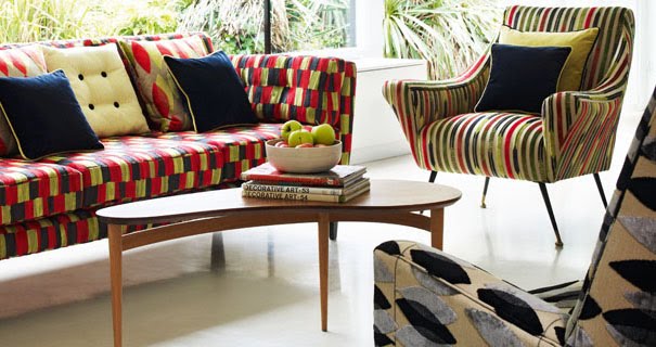
We also need a new couch, as I’ve previously posted about, and I think this would do very nicely. I love this chair too, but I’d prefer it a little less bold to be honest. I wouldn’t turn the table down either, if pushed. Oh, and the radio/stereo in the background, please!


If I’ll ever live in a house with a staircase, I shall be sure to stand like this wearing long gloves and have my morning coffee every weekend.


And even though I prefer darker woods for my furniture (teak or cherry to be specific), I still very much like these lighter ones, especially that little side table. I like side tables, they don’t allow themselves to get too messy, which is a good quality in my book. They hardly even allow coffee table books to be put on them. Good thing I’ve got shelves for them.


“Wrappings” is a contemporary wallpaper design, available in five different colours. I’m actually quite hesitant about putting up wallpapers in my home, simply because I love putting up posters and postcards and paintings so much. And it would all be too busy, even for my busy taste. But I really like the idea of wallpapers, especially pretty vintage looking one’s like these.


“Miro” is a wallpaper developed from a classic fabric print from the 50’s, and it comes in seven different colourways. This one with the turqouise and terracotta is my favorite.


“Fifi” is an original design from the 50’s, depicting the very classic New Look silhouette that was launched in 1947 by Christian Dior. It pretty much goes without saying that it would look adorable as a dress fabric. Which might be a bit tricky though, since it’s a wallpaper. For now at least.


“Seaweed” was originally designed in 1954 and is a fabric. I’m thinking a nice full width skirt would look very nice in this.


“Mobiles” is an original 50’s design that comes both as a fabric and as a wallpaper, in five different colourways. I’m certain this teal version would make a supercute dress.


“Hayward” is a contemporary design made to look like decorations on Poole pottery from the 50’s. I’m liking these pale colours a lot.


But I’m also liking the bolder colours. Perhaps an apron in this fabric? I think it would work wonders.


“Dandelion clocks” is designed by contemporary artist Fiona Howard, and is probably my favorite of the bunch. I would love a dress in this fabric. But also a wallpaper in a walk-in-closet in that house with the staircase where I might live one day. And I’ll also keep at least one three legged sidetable in there.


This is “Miro” the velvet fabric, obviously similar to “Miro” the wallpaper as seen above, but yet different with smaller leaves. Much like the wallpaper it comes in seven different colour combinations. I think this red and vanilla combo would look excellent in a skirt.


And finally I’d take this classic black and grey version in a chair, maybe the one in the third picture above. Yes, I think I would be quite happy with this, quite happy indeed.